


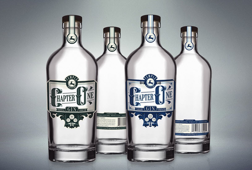
Every book starts with Chapter One and that’s exactly where startup craft spirits distiller Temple Distilling started with ‘Chapter One Gin’ their flagship product. And speaking of flagship, their second product is a variation on Chapter One, no, not Chapter Two but, Chapter One Navy Strength Gin. Navy Strength offers a variation in flavors, a higher proof and subtle changes in design. And that’s what leads us to talk about label design with Scott Wetzel of Fresh Bread Design.
Chapter One Traditional London Dry Gin and Navy Strength Gin
Stay Informed: Sign up here for the Distillery Trail free email newsletter and be the first to get all the latest news, trends, job listings and events in your inbox.
Scott says when he first met first generation distillers, AJ and Jamie Temple, they were still in the beginning stages of getting their license to produce distillates from the Alcohol and Tobacco Tax and Trade Bureau – TTB. He had never tasted anything they made and from what he could tell, they had never made any spirits. They were young and fresh faced, excited to make good gin. And everyone wants to make good spirits.
I walked away from the meeting knowing we’d be working together. There was no contract signed yet, no money on the table…but everything about this seemed right.
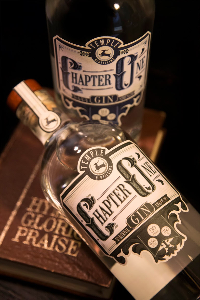
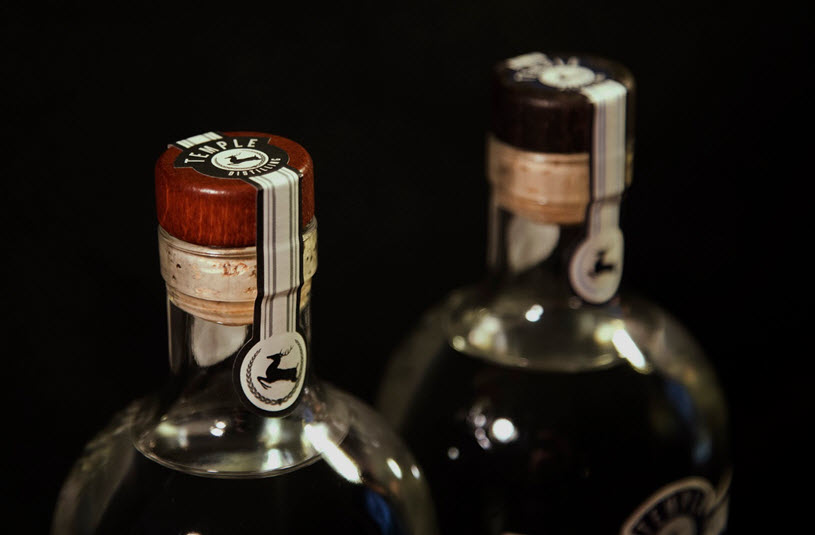
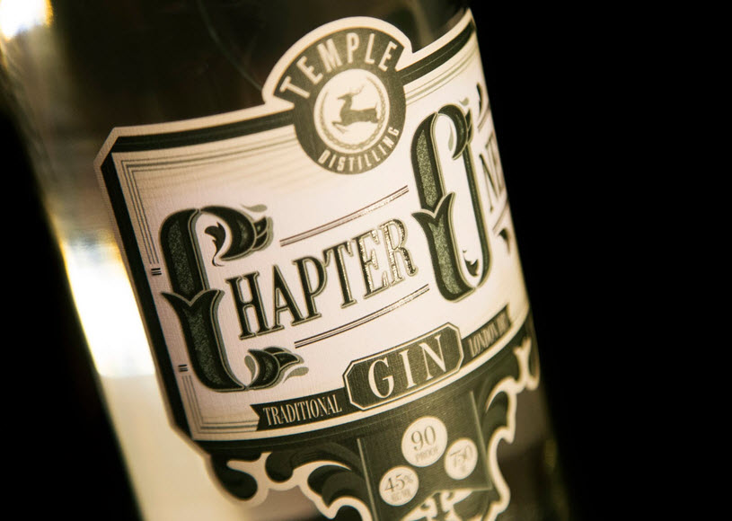
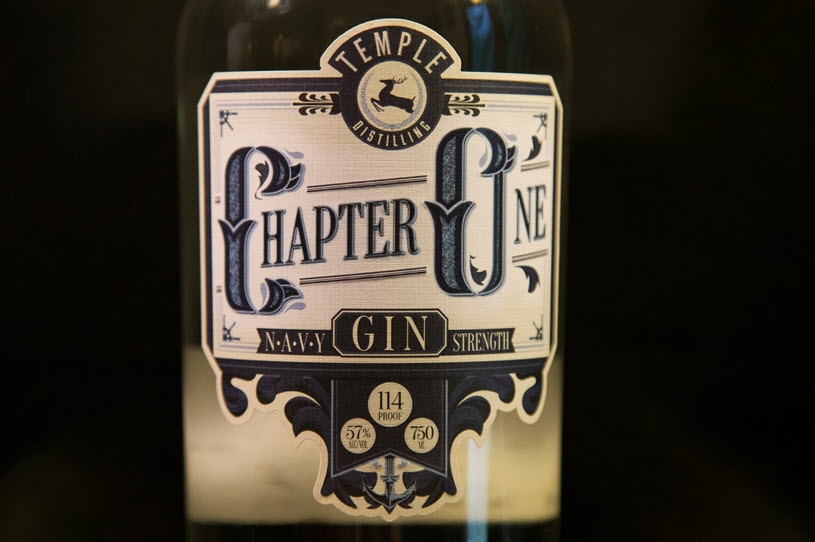
Well, in the end the contract was signed. It turns out my instincts were right. These guys have a knack for making great gin. It’s classy. It’s dry. It’s not boring at all. So Temple Distilling‘s Chapter One Gin and Chapter One Navy Strength Gin both deserved a label that spoke all of those things. We wanted it to be classic without being stuffy. It has custom lettering. It has embossing hidden in places you can’t see but changes the tactile feel. It has spot varnish in all the right places. Even the linen paper style is one that harkens back to earlier days. The dieline is complex and the two gins have some subtle design differences that help differentiate more than just color coding. Look close at the label and you’ll see the Fleur-Di-Lis on the flagship gin is replaced by an anchor on the Navy Strength Gin. ~Scott Wetzel
Much of the influence for this design came from antique tobacco tins. Many of them not only have great design, but also showcase incredible patinas. The goal was to match that aesthetic for this product in order to showcase the time and respect for heritage Temple Distilling puts in every bottle. They achieved this by using a mix of custom and boutique typography, hand-created filigrees and very subtle gold foil and embossing.
Please help to support Distillery Trail. Like us on Facebook and Follow us on Twitter.
Chapter One London Dry Gin and Navy Strength Gin Bottles
Chapter One London Dry Gin and Navy Strength Gin Caps with Seals
Chapter One Traditional London Dry Gin Front Label
Chapter One Navy Strength Gin Front Label
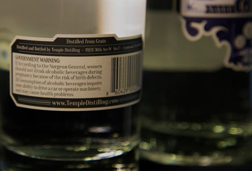
Chapter One Gin Back Label
All photos are were taken and prepared by Essence Photography.