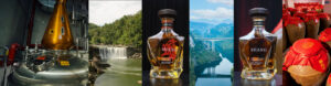


The craft spirits category is young, thriving and growing at a phenomenal pace. The diversity and style of craft spirits packaging is a delight for spirits lovers and design lovers alike, offering a feast for the eyes as well as for the palate. However, if the growth model of the wine and craft beer categories holds true for spirits, we’ll eventually see some brands rise to the top and become iconic, while others languish in obscurity. As the shelves become more crowded, the importance of a thoughtful, strategic approach to brand development cannot be overstated. Good product quality is necessary for a brand’s reputation to take hold, but strong branding and packaging are keys to getting people to try your product in the first place. They provide the vehicle that will give your brand momentum and longevity.
What is Branding?
A brand is more than a logo or a label. Marketer and author, Seth Godin, defines a brand as
“the set of expectations, memories, stories and relationships that, taken together, account for a consumer’s decision to choose one product or service over another.”
People buy brands, and then share them, based upon their emotional response to what they see and hear. Yes, the product quality matters, but studies have shown that even the customer’s flavor experience is strongly influenced by the package design. Branding is the strategic process by which we uncover and develop this deeper story, draw out its unique emotional appeal, and then express it through the brand name and package design. Branding includes the verbal and visual expression of the distiller’s story and every aspect of the brand’s identity in the marketplace, from the bottle to the website.
Branding Starts with Strategy
Branding, when done well, starts with a deep exploration of the story of the people, production process and idea behind your product. The distillers, distributors and retailers we interviewed for Branding Distilled: A Guide to Package Design for Crafts Spirits consistently mentioned the importance of a well-expressed, authentic story. People seek an emotional connection to the brands they purchase, and this drives their willingness to pay a premium for a distilled spirit. A compelling story is what motivates retailers, and ultimately consumers, to select one brand over another.
Your unique brand story answers the questions of,
- Why your product exists
- Why it is special
- Why people should care
It expresses the big idea behind your product, and answers the questions about how and by whom it’s made, what ingredients and care go into it, and where it’s from. It’s memorable, relatable, compelling and always ties back to the product itself. Your brand name should embody this big idea, and the visual expression of that idea becomes the basis for your package design.
Stay Informed: Sign up here for our Distillery Trail free email newsletter and be the first to get all the latest news, trends, job listings and events in your inbox.
A Package is About More Than Aesthetics
Good packaging design is an aesthetic delight, and, as designers ourselves, we are easily seduced by style, detail and imagery for its own sake. What makes a package great, however, goes far beyond pure aesthetics. Packaging has a job to do—in many cases it is the only communication vehicle your brand has, and must make the sale without any additional information. A great package should fit its category but also stand out within it. It should grab the eye from the retail shelf and the back bar. And once it has captured attention, it must convey the essence of the brand and invite the viewer to explore more deeply. It must express the brand’s personality, and deliver the key reasons to believe. As the craft spirits category becomes more crowded, branding takes on new and growing importance.
The Anatomy of Package Design
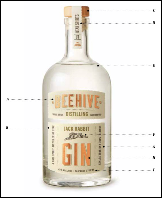 A – Brand Logotype
Your brand name and its typographic treatment convey your brand’s unique character. Make sure the brand name is large enough to read from a back bar, contrasts well with the background color, and that the letterforms are easy to decipher. No matter how recognizable your label or bottle is, your brand name must be easy to recall and easy to say, so that consumers are comfortable asking for it.
B – Label Shape
A unique label shape helps your package stand out and be memorable. This is especially important when using a stock bottle shape.
C – Closure
The closure is an opportunity to reinforce branding and convey product quality. Attention to detail here pays off, since the end user will handle this part of your package each time they open the bottle.
D – Neck Label
Whether wrapped over the closure vertically or applied around the neck, a neck label conveys the distiller’s attention to detail. It’s a good place to add secondary messaging without cluttering the face label. The neck label can be used to color code different product types within the line.
E – Bottle Shape
Your bottle shape is the first thing noticed and should fit the product category while also being as distinctive as possible within it. Visualize the brands you know well, and notice how key the bottle shape is to recalling the package.
F – Illustration or Icon
A custom illustration or graphic symbol visually expresses your brand story. It also works as an identifier when describing the brand, and is especially useful when the name is hard to recall.
G – Romance or Descriptive Copy
A few key words that describe the unique qualities of your product or tell your brand story can be a powerful addition to the front panel, so long as they don’t interfere with the readability and impact of the brand logo and other critical information.
H – Product Type
The prominence of the product type can vary depending on how many SKUs are in your line. It should be secondary to the brand name. Consumers and bartenders need to identify what is in the bottle, but this information should not override the brand name or visual story.
I – Legal Copy
The TTB regulates the size and position of alcohol content and volume. We’ll have more information about compliance and the approval process for labels in a later post. You can sign up for our newsletter here to be notified of the next steps.
Back Panel (not pictured)
Once your front panel and bottle shape have enticed a consumer to pick up your bottle, the back panel copy is your opportunity to tell them more about your product and story. Don’t skimp on copywriting – the content and the tone of voice used here are a big part of your brand’s expression.